A recognized leader in event technology
Award-winning event software.
RSVPify is honored to be recognized for its innovation, intuitive event software functionality, and exceptional customer support.
Top Rated on G2
4.7/5
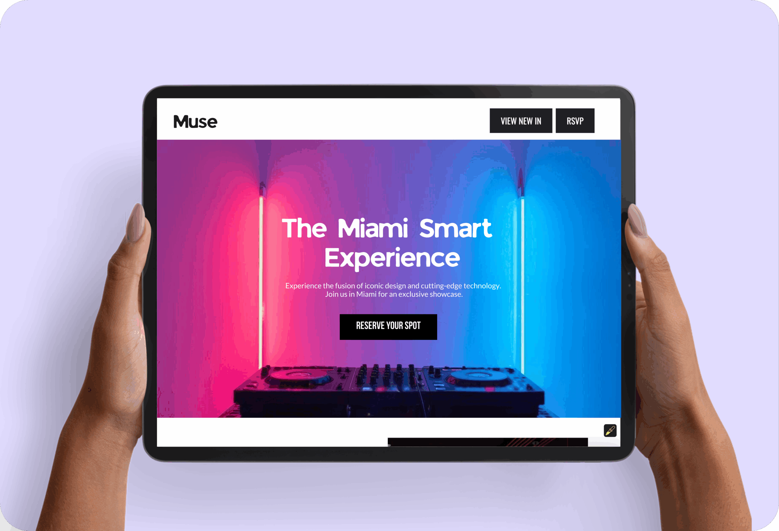
Drag, drop, and publish a fully branded event landing page with RSVP, ticketing, schedules, and security built in. No code or designer required.

Completely integrate your theme or your organization’s branding - not ours. Send branded event invites or event emails.
Collect payments + donations or manage event ticket sales easily. Create ticketing tiers, export event data for accounting, and receive funds within 48 hours.
Already have an event website on Wix, Squarespace, WordPress, or elsewhere? Easily embed your event registration form in minutes.
Other event website builders limit your design and branding options. RSVPify is the industry leader in customization - create an event website entirely your own.
Unparalled branding + customization
RSVPify is the industry-leader in control and customization for users. Make your brand or theme the focus, not ours.
Simple + powerful event website design
No need for a design background. Our customizable event website templates can be tailored to every event in minutes.
Powerful event management tools
More than just event website software. Create a bespoke registration experience, collect event payments, check-in guests, and more.
RSVPify is honored to be recognized for its innovation, ease of use, and exceptional customer support — see what our customers have to say:

Diana B
Communications Strategist
"RSVPify has been instrumental in helping us communicate with our employees and community partners. It’s a dynamic and useful tool for promoting events effectively, and the staff helped answer questions we had at a moment's notice! Couldn’t be happier with the how RSVPify has helped up engage our community."

Purina Nestle
Tiffany K
Associate Director of Alumni Relations
“As an event leader or manager, you have to communicate everything that is happening. RSVPify made it easy for me to do my job - i.e., to see numbers of who responded, who has not yet responded, communicating all in one spot, updating event details in a quick way. I feel like it saved me hours.”
The Bush School

Darius T
Commercial Director
"RSVPify has been a game-changer for managing our awards event invitations. It’s sleek, intuitive, and helps us deliver a seamless experience to our high-profile guests.”

WhatsOnStage

Sophie C
Wildlife Conservation Network
“RSVPify’s system allows us to manage RSVPs on an individual level within groups or families, which is a game-changer for us. It enables us to have more personalized communication with our donors, like sending specific messages about who we look forward to seeing at an event and who we’ll miss. This level of detail and personalization was something we couldn’t find with other platforms.”

Wildlife Conservation Network

Taryn W
Creative Director
“Hands down, [RSVPify] has streamlined event registration. It’s easier for attendees to register, it’s saved us admin time, and it’s made communicating with event attendees so much easier.”
Blockchain Association
Bill R
Director of the Amici Fund & Alumni Relations
“RSVPify has been my favorite of all of the event management platforms that I've used. People need to gather for community - for their health, for their mental health. So what a great tool that you're building for people to create events.”

Woodberry Forest School
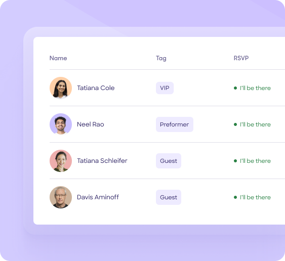
Track RSVPs send targeted event comms.
Create online invitations or upload your own design.
Create smart pricing tiers and exclusive VIP offerings.
Use custom questions and form logic for curated registration experiences.
Let guests select multi-course meals and share dietary needs.
Manage invite-only sub-events with ease.
Hosting a private event? Keep it exclusive with advanced security.
Easily manage check-in from any device with RSVPify’s check-in system.
RSVPify is honored to be recognized for its innovation, intuitive event software functionality, and exceptional customer support.

RSVPify’s event website creator lets you create a fully branded event microsite with custom pages, imagery, RSVP forms, ticketing, schedules, FAQs, and more. Everything is integrated—no coding, plugins, or third-party hosting required.
No. The builder uses drag-and-drop tools and customizable templates to help you create a professional site without web design skills. You can launch a polished event website in minutes.
Yes. You can customize colors, fonts, backgrounds, block formats, and imagery to match your brand or theme.
Yes. RSVPify offers custom URLs and allows you to map your own domain for a fully branded, professional event presence. This is ideal for corporate, nonprofit, and large-scale events.
Everything is built-in. Your event website can include RSVP forms, ticket sales, schedule pages, maps, FAQs, showcase sections, and attendee resources—all synced directly to your event dashboard.
Yes—RSVPify websites are fully responsive and optimized for mobile viewing. Guests can RSVP, purchase tickets, and view event information on any device without friction.
Yes. You can easily embed RSVPify’s registration form on your website, landing page, or microsite. All responses automatically sync to your RSVPify dashboard, keeping your data connected and your guest experience seamless.
Yes. RSVPify supports password-protected event websites and invitation-only registration. While guests can be required to enter a password to view the website, registration access can also be restricted to approved guests on your invitation list.
RSVPify integrates with thousands of applications through Zapier, including Salesforce, HubSpot, Mailchimp, and Google Sheets. Automate attendee data syncing, follow-up communications, and reporting workflows without manual data entry.
Absolutely. You can embed videos, upload image galleries, and more. This allows you to build a highly informative event hub for guests.
RSVPify is used for conferences, galas, corporate events, weddings, school events, fundraisers, alumni programs, private parties, product launches, and more. Any event that needs a polished, organized online home benefits from a dedicated event website.
Yes. RSVPify has an ever-expanding library of stylish event website templates for all common event types. Customize them or add your own designs or elements as needed.